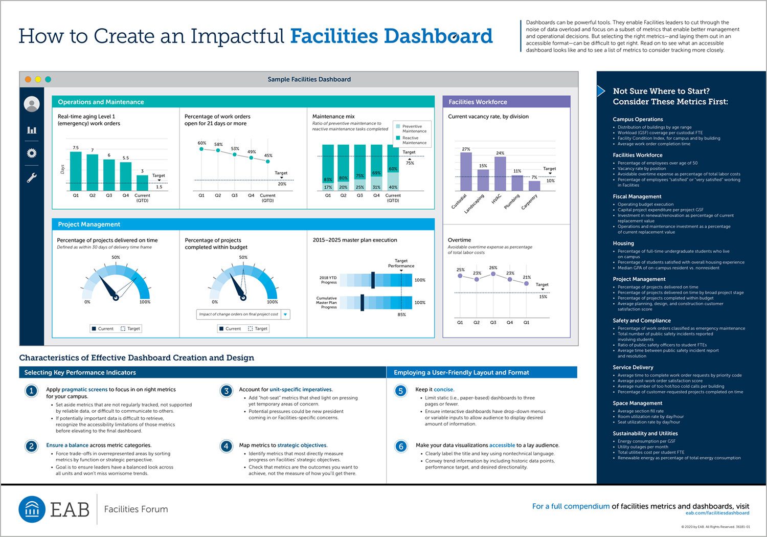
How to create an impactful facilities dashboard
Facilities leaders have access to an unprecedented amount of data stemming from a wide array of sources. In addition to operational and financial metrics, Facilities units track sustainability metrics, building condition, and utilities consumption at the campus, college, and building level. And these data stem from many different systems, including customer satisfaction and post-work order surveys, computerized maintenance management systems, and capital project databases.
As higher education institutions tap into more data, they recognize the need for a tool to organize metrics and inform business processes. Dashboards are a proven tool that other industries, such as retail and finance, have long used to manage, track, and analyze data to inform decision-making. In fact, some higher education institutions have started to implement dashboards with great success.
Dashboards are a proven tool that other industries, such as retail and finance, have long used to manage, track, and analyze data to inform decision-making. There are three main challenges in building a Facilities-focused dashboard. The first is how to determine the metrics that best measure Facilities performance. The second challenge in building a Facilities dashboard is how to display metrics in a compelling, accessible format. Poor dashboard design and layout can derail efforts by making data difficult to interpret. The final challenge is how to choose appropriate targets and action triggers. Without goals or a formal system of red flags, leaders often fail to understand metric performance or act on negative trends.
Download the infographic to see what an accessible dashboard looks like and get a list of metrics to consider tracking more closely.
More Resources


Create a Compelling Facilities Dashboard

