
Table of Contents
Table of Contents
- Accordion Blocks
- CTA Blocks
- Differentiators Block
- Experts Block
- Fancy Cards Block
- Featured Carousel Block
- Features Block
- Featured Experts Block
- Featured Podcast
- Featured Blog Posts
- Image Block
- Links Grid Block
- Logo Carousel Block
- Logo List Block
- Numbered Card Group Block
- People Grid Block
- Related Partner Stories Block
- Resource Collection Block
- Stats Block
- Table Block
- Testimonial Block
- Text + Icon Blocks
- Video Block
- WYSIWYG/Text Block
- Top of Page Hero Banner Details
Accordion Blocks
Accordion blocks should be used to hide certain content, so a user can opt-in to seeing more information about a topic by clicking the accordion drop down. Accordions are also effective in shortening the length of a page and allowing a user to more easily skim a page and view what’s most relevant to them. There is the option to have the first accordion open or closed, the background and accordion colors reversed, and no section title + description (just the accordion itself).
Accordion Option 1 (light) (title is optional)
Title (required)
Description (required). The inside of accordions have the same text formatting options as the text/WYSIWYG block.
Lorem ipsum
Lorem ipsum dolor sit amet, consectetur adipiscing elit, sed do eiusmod tempor incididunt ut labore et dolore magna aliqua. Arcu non sodales neque sodales ut etiam sit amet nisl. Est ante in nibh mauris. Iaculis urna id volutpat lacus laoreet non. Nisi scelerisque eu ultrices vitae auctor eu augue ut. Cras tincidunt lobortis feugiat vivamus at augue eget arcu dictum. Scelerisque eu ultrices vitae auctor eu augue ut lectus. Faucibus vitae aliquet nec ullamcorper sit.
Lorem ipsum
- Quis commodo odio aenean sed
- Arcu dictum varius duis at consectetur lorem donec massa sapien
- Interdum posuere lorem ipsum dolor sit amet consectetur adipiscing
Accordion Option 2 (dark) (title is optional)
Title (required)
Description (required). The inside of accordions have the same text formatting options as the text/WYSIWYG block.
Lorem ipsum
Lorem ipsum dolor sit amet, consectetur adipiscing elit, sed do eiusmod tempor incididunt ut labore et dolore magna aliqua. Arcu non sodales neque sodales ut etiam sit amet nisl. Est ante in nibh mauris. Iaculis urna id volutpat lacus laoreet non. Nisi scelerisque eu ultrices vitae auctor eu augue ut. Cras tincidunt lobortis feugiat vivamus at augue eget arcu dictum. Scelerisque eu ultrices vitae auctor eu augue ut lectus. Faucibus vitae aliquet nec ullamcorper sit.
Lorem ipsum
- Quis commodo odio aenean sed
- Arcu dictum varius duis at consectetur lorem donec massa sapien
- Interdum posuere lorem ipsum dolor sit amet consectetur adipiscing
CTA Blocks
CTA blocks come in 3 types: small, large, and global demo forms, and are used in specific places on pages.
Small CTAs
- Thinner CTA blocks that are used in the middle of content to draw attention to other relevant resources
- Come in two color options: light and dark
- Requires title text, description text, button text, and a link
Large CTAs
- The main CTA placed at the end of a page
- Can be toggled on or off for pages like blogs, infographics, etc.
- Comes in one standard color option
- Requires title text, description text, button text, and a link
Form CTAs (Global Demo Request Forms)
- Can replace the large CTA at the end of a page
- Must be connected to a specific product line in Marketo
- Required title text and description text
Form CTA (title required)
This version of a CTA appears at the end of a page and must be connected to a product in Marketo. (description required)
Differentiators Block
This block is typically used on solutions pages only to display a brief overview of the product’s benefits. See the “What Sets Enroll360 Apart?” section of the Enroll360 Solution Page for an example. This block can come left or right aligned and has the options for text or number features.
Required elements:
- Main Title
- Image (1:1 aspect ratio, 930px x 930px in size) – image will auto-adjust if not in 1:1 ratio, resulting in a compacted visual.
- Up to 4 subcategories for text option – with titles and description text for each. This does not have a subscription option.
- Up to 3 subcategories for numbers option – with titles and description text for each. This does have a sub-description option.
Differentiator Opt. 1 - Left (title required)
-
Title 1 (required)
Description is required.
-
Title 2
Lorem ipsum dolor sit amet, consectetur adipiscing elit, sed do eiusmod tempor incididunt ut labore et dolore magna aliqua. Ut enim ad minim veniam, quis nostrud exercitation ullamco laboris nisi ut aliquip ex ea commodo consequat.
-
Title 3
Lorem ipsum dolor sit amet, consectetur adipiscing elit, sed do eiusmod tempor incididunt ut labore et dolore magna aliqua. Ut enim ad minim veniam, quis nostrud exercitation ullamco laboris nisi ut aliquip ex ea commodo consequat.
-
Title 4
Lorem ipsum dolor sit amet, consectetur adipiscing elit, sed do eiusmod tempor incididunt ut labore et dolore magna aliqua. Ut enim ad minim veniam, quis nostrud exercitation ullamco laboris nisi ut aliquip ex ea commodo consequat.
Differentiator Opt. 2 - Right (title required)
-
100+
Lorem ipsum dolor sit amet, consectetur adipiscing elit.
Optional sub-description -
50
Sed do eiusmod tempor incididunt ut labore et dolore magna aliqua.
Optional sub-description -
25%
Sed ut perspiciatis unde omnis iste natus error sit voluptatem accusantium doloremque laudantium.
Optional sub-description
Experts Block
This block can showcase up to three experts on eab.com. Experts must currently have a published bio on the site in order to be included. Expert names, titles, and headshots are all pulled in from their expert bio and cannot be adjusted here.
Required elements:
- Expert names (up to 3)
Title is Optional


Fancy Cards Block
This block can be used to call out a variety of topics. It has two card color options: dark and light, and three background colors: dark, light, and patterned. Text and icons can be either left or center aligned and a hover option can be toggled on or off. Links can be added to each individual card. More than three cards can be used in one section, but the block will only allow three cards per row. Text within the cards can be bolded or italicized, but bulleted lists and hyperlinks will not work.
Notes:
- Cards with the dark background should only use teal icons
- Cards with the light background can use the blue or teal icons
- The patterned background should only be used with the light card option
Required elements:
- Icon
- *While not technically required, a card title and description text is strongly recommended for the best visual results
Fancy Cards Light Background
-


Lorem ipsum
Lorem ipsum dolor sit amet, consectetur adipiscing elit, sed do eiusmod tempor incididunt ut labore et dolore magna aliqua.
-

Lorem ipsum
Lorem ipsum dolor sit amet, consectetur adipiscing elit, sed do eiusmod tempor incididunt ut labore et dolore magna aliqua.
-

Lorem ipsum
Lorem ipsum dolor sit amet, consectetur adipiscing elit, sed do eiusmod tempor incididunt ut labore et dolore magna aliqua.
Fancy Cards - Dark Background
-
Lorem ipsum
Lorem ipsum dolor sit amet, consectetur adipiscing elit, sed do eiusmod tempor incididunt ut labore et dolore magna aliqua.
-

Lorem ipsum
Lorem ipsum dolor sit amet, consectetur adipiscing elit, sed do eiusmod tempor incididunt ut labore et dolore magna aliqua.
-

Lorem ipsum
Lorem ipsum dolor sit amet, consectetur adipiscing elit, sed do eiusmod tempor incididunt ut labore et dolore magna aliqua.
-

Lorem ipsum
Lorem ipsum dolor sit amet, consectetur adipiscing elit, sed do eiusmod tempor incididunt ut labore et dolore magna aliqua.
Fancy Cards - Patterned Background
-

Lorem ipsum
Lorem ipsum dolor sit amet, consectetur adipiscing elit, sed do eiusmod tempor incididunt ut labore et dolore magna aliqua.
-

Lorem ipsum
Lorem ipsum dolor sit amet, consectetur adipiscing elit, sed do eiusmod tempor incididunt ut labore et dolore magna aliqua.
-

Lorem ipsum
Lorem ipsum dolor sit amet, consectetur adipiscing elit, sed do eiusmod tempor incididunt ut labore et dolore magna aliqua.
Featured Carousel Block
This block used on landing pages such as focus areas/institution type pages – not recommended for resource pages such as blogs, infographics, etc. Block should have a minimum of 3 resources to display.
Required elements:
- Slide title
- Slide description
- Image
- Resource link + button text
Lorem ipsum 2
Lorem ipsum dolor sit amet, consectetur adipiscing elit, sed do eiusmod tempor incididunt ut labore et dolore magna aliqua.
Learn More
Lorem ipsum 3
Lorem ipsum dolor sit amet, consectetur adipiscing elit, sed do eiusmod tempor incididunt ut labore et dolore magna aliqua.
Access Now
Lorem ipsum 4
Lorem ipsum dolor sit amet, consectetur adipiscing elit, sed do eiusmod tempor incididunt ut labore et dolore magna aliqua.
Get the Resources
Lorem ipsum 5
Lorem ipsum dolor sit amet, consectetur adipiscing elit, sed do eiusmod tempor incididunt ut labore et dolore magna aliqua.
Download Now
Features Block
These blocks are widely used on solutions pages, focus area pages, resource centers and institution type pages. This block type is not recommended for use on blogs and other resource pages.
They can be used with or without flair elements, with lottie animations, or embed scripts. Links can also be added to each card. The default is set to left/right alternating text/image orientation. Card can be set as the featured row which applies a light teal background color to the feature instead of the default white/grey background. Image with/without flair elements should be 532x355px (recommended image aspect ratio is 3:2).
Only one graphic type is allowed per block section. You cannot combine static images, Lotties, and embed scripts within one alternating block.
Real page examples:
- Lotties – Edify Solution Page
- Image without flair – ALR Solution Page
- Image with flair – Advancement Advisory Solution Page
Required elements:
- Image (3:2/532x355px), Lottie, or embed script (Youvisit)
- *Strongly recommended to have a card title and description
Card Title (optional) With Flair
Description (optional) – Example with flair element.
Lorem ipsum dolor sit amet, consectetur adipiscing elit, sed do eiusmod tempor incididunt ut labore et dolore magna aliqua. Ut enim ad minim veniam, quis nostrud exercitation ullamco laboris nisi ut aliquip ex ea commodo consequat.

Lorem Ipsum Dolor Sit Amet
Lorem ipsum dolor sit amet, consectetur adipiscing elit, sed do eiusmod tempor incididunt ut labore et dolore magna aliqua.
Lorem Ipsum (Featured)
Lorem ipsum dolor sit amet, consectetur adipiscing elit, sed do eiusmod tempor incididunt ut labore et dolore magna aliqua. Ut enim ad minim veniam, quis nostrud exercitation ullamco laboris nisi ut aliquip ex ea commodo consequat.
- Lorem ipsum dolor sit amet
- Consectetur adipiscing elit
- Sed do eiusmod tempor incididunt ut labore et dolore magna aliqua.
Card Title (optional) Without Flair
Description (optional) – Example without flair element.
Lorem ipsum dolor sit amet, consectetur adipiscing elit, sed do eiusmod tempor incididunt ut labore et dolore magna aliqua. Ut enim ad minim veniam, quis nostrud exercitation ullamco laboris nisi ut aliquip ex ea commodo consequat.
Card Title (optional) With Lottie Animation
Description (optional)
Lorem ipsum dolor sit amet, consectetur adipiscing elit, sed do eiusmod tempor incididunt ut labore et dolore magna aliqua. Ut enim ad minim veniam, quis nostrud exercitation ullamco laboris nisi ut aliquip ex ea commodo consequat.
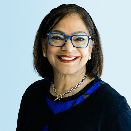
Featured Experts Block
This block can showcase up to four experts. Experts must already have a published bio on eab.com before they can be featured in this block. To request a bio, please fill out this form. This block is typically used on solutions pages as a contact call to action. See the Enroll360 Solution Page for a real life example of the block.
Experts info (headshot, title, specialties) is pulled in directly from their expert bios and cannot be edited. Any changes need to be edited on the expert bio page.
Required elements:
- up to 4 experts with published bios
- Overline/eyebrow text
- *Strongly recommended to have a title and description text
Title (optional but strongly recommended)
Description text. (optional but strongly recommended)
Optional Link
Director of Partnerships, Student Success
Specialties Accountability and Assessment, Diversity and Inclusion, Organization Change Management, Strategic Planning, Student Affairs
Partner Experience Senior Associate
Specialties Data and Analytics, Experiential Learning, Student Affairs, Student Success, Student ExperienceFeatured Podcast Block
This block is designed to showcase one podcast episode. All information is pulled directly from the podcast page and cannot be edited within the block. This block can be used on resource pages and others a needed.
Required elements:
- Podcast episode

A Silver Lining? COVID-19 Reforms May Improve Student Support
Featured Blog Posts Block
This block can be used on resource centers and landing pages. There must be four blogs in this block (max + minimum). Blog must be already published to be included.
Required elements:
- Block title
- List of published blog to be featured
Title (required)
'No net new': What stuck with university leaders at our Campus Space Summit

10 tips for a great summer staff retreat

2 emerging law school recruitment challenges – and how to address them

Are you meeting students’ basic needs?
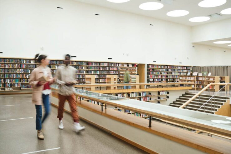
Image Block
There are two options for this block: max-width full-bleed ON and max-width full-bleed OFF. When the max-width, full-bleed option is toggled OFF, this block can have an optional items (title, description, and link) added to the block. When max-width, full-bleed is toggled ON, you can have an image caption only.
Image specs recommended: 750x1500px landscape orientation
Required elements:
- image
Optional Title (full-bleed OFF)
Links Grid Block
This block can be used to promote multiple related resources or next steps. You can have more than three cards added, but the block will auto-format to break the row after three cards.
Required elements:
- Card title
- Card description
- Card link + link text
-
Lorem ipsum
Lorem ipsum dolor sit amet, consectetur adipiscing elit, sed do eiusmod tempor incididunt ut labore et dolore magna aliqua.
-
Dolor sit amet
Lorem ipsum dolor sit amet, consectetur adipiscing elit, sed do eiusmod tempor incididunt ut labore et dolore magna aliqua.
Logo Carousel Block
This block is animated with a scrolling list of logos. Logos will be displayed on a dark background only. Logos should be white with a transparent background with a 1:1 aspect ratio (120px x 120px). In order to have the scrolling animation, the block requires eight logo files.
Required elements:
- Title
- 8 Logos – white with transparent backgrounds and a 1:1 aspect ratio (120x120px)
- Can repeat logos to meet the 8 minimum for scrolling
Title (required)
Logo List Block
This block is a static list of logos. Logos will be displayed on a dark background only. Logos should be white with a transparent background with a 1:1 aspect ratio (120px x 120px). The block will auto-format to five logos per row.
Required elements:
- Title
- Logos – white with transparent backgrounds and a 1:1 aspect ratio (120x120px)
Title (required)
Optional Link
Numbered Card Group Block
This block is best used to demonstrate steps or numbered items with descriptions. There are two number styles: Default and circle. There are three background styles: none, outline, and color. The color backgrounds have these options: white, light grey, light teal, light blue, and navy blue (white and light teal are most common). Bulleted lists cannot be used in these blocks and hyperlinks cannot be added unless formatted as a button.
Required elements:
- Card titles
- Card descriptions
Group Title (optional) - Outline Background
-
Card Title (required)
Card description (required).
-
Lorem Ipsum
Lorem ipsum dolor sit amet, consectetur adipiscing elit, sed do eiusmod tempor incididunt ut labore et dolore magna aliqua.
Group Title (optional) - No Background
-
Card Title (required)
Card description (required).
-
Lorem Ipsum
Lorem ipsum dolor sit amet, consectetur adipiscing elit, sed do eiusmod tempor incididunt ut labore et dolore magna aliqua.
Group Title (optional) - Color Background
-
Card Title (required)
Card description (required).
-
Lorem Ipsum
Lorem ipsum dolor sit amet, consectetur adipiscing elit, sed do eiusmod tempor incididunt ut labore et dolore magna aliqua.
People Grid Block
This block is a way to show people on the site with more flexibility in the information shared. This can be used with or without headshots, titles, and links to bios. See the Leadership Page for examples of this block in use. Headshots should be the official EAB portrait created by DSS. Can have more than four names, but block will start a new row after four.
Required elements:
- Names
- *Strongly recommended to have title or photo for visual purposes.
Title (optional) - With Photos + Link
Description (optional).


Title (optional) - Without Photos + Link
Description (optional).
Related Partner Stories Block
The block can be used on landing pages and most resource pages. There is a max of three partner stories that can be featured in this block. There is a choice between white and light grey backgrounds. Title and logo is pulled in from the partner story page and cannot be edited within this block.
Required elements:
- Partner stories (max 3)
Title (optional) - White Background
Optional Link

Title (optional) - Light Grey Background
Optional LinkResource Collection Block
This block can feature up to four different resources on landing pages and resource centers and max three on resource pages. These will be placed at the end of a resource page before the end cap CTA. Featured items can be any type of resource as long as they are an eab.com page. Marketo pages cannot be added here (pages.eab.com). There are three style options: default, dark, and light. The grid layout of these cards is determined by the number of cards present. The first resource listed will appear as the largest card when there is either one or four resources related to this block.
Required elements:
- eab.com resources (max 4 for landing pages + resource centers) (max 3 for resource pages)

Higher Ed's Talent Imperative

10 higher ed podcasts to stream in 2023
How to Build a Sense of Belonging Among Black and Latino Men
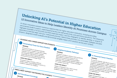
Unlocking AI's potential in higher education
Stats Block
A statistics block presents up to three statistics and can have a light teal or dark blue background. This block looks best with three statistics and is best used on less-text-heavy pages, such as resource centers or partner services (instead of blogs or research reports) so as not to distract from body content.
Animation can be toggle on or off for each individual statistic.
Required elements:
- Number
- Description under number
Title (required) - Light Teal with Animation
Optional Link100
Lorem ipsum dolor sit amet25%
Lorem ipsum dolor sit amet80+
Lorem ipsum dolor sit ametTitle (required) - Navy Blue No Animation
Optional Link100
Lorem ipsum dolor sit amet25%
Lorem ipsum dolor sit amet80+
Lorem ipsum dolor sit ametTable Block
This block can be used to present data or information in a table. There is an option for the default-width and full-width.
Required elements:
- Table data – headings, content, etc.
Table Title (optional) Default-Width
| Heading | Heading | Heading | Heading |
|---|---|---|---|
| Row 1 | Table content | Table content | Table content |
| Row 2 | Table content | Table content | Table content |
| Row 3 | Table content | Table content | Table content |
| Row 4 | Table content | Table content | Table content |
Table Title (optional) Full-Width
| Heading | Heading | Heading | Heading |
|---|---|---|---|
| Row 1 | Table content | Table content | Table content |
| Row 2 | Table content | Table content | Table content |
| Row 3 | Table content | Table content | Table content |
| Row 4 | Table content | Table content | Table content |
Testimonial Block
This block is used for quotes on a variety of resource and landing pages. They are available in Teal, Navy Blue, or Dark Navy Blue, and can house up to 5 quotes in a carousel format.
Testimonial Blocks can feature images. When an image testimonial block is used, image should be 800x1200px (jpg/png) but will be rendered down to 400x400px. The flare elements on an image testimonial can be toggled on or off. Image testimonials also have the option to add a link.
Required elements:
- Quote
- Quote attribution (can be anonymized)
- School attribution (can be anonymized)
- Image (800x1200px) if wanting an image testimonial
Text + Icon Blocks
This block displays information in boxes. This block is one of the most versatile and has the benefit of taking up less space than CTA blocks and statistics blocks. This block can be used to callout a fact or statistic, steps or elements of a process, and it can act as a table of contents for content types like resource centers.
Blocks can be left or center-aligned and have 3 background options: none, outline, and color. Color options are white, light grey, light teal, light blue, and navy blue. Icons should only be the navy or teal options from DSS and have the option to be put in a circle.
Buttons and bulleted lists can be added to each block.
Required elements:
- Icon (teal or blue)
- Title
-
Title (required)
Description is optional. This example is left-aligned and has no background style.
-

Lorem ipsum
This example is left-aligned, has a circle icon, and has the color background in light teal.
-

Lorem ipsum
-

Consectetur adipiscing elit
-

Dolor sit amet
-

Lorem ipsum
Lorem ipsum dolor sit amet, consectetur adipiscing elit
-

Consectetur adipiscing elit
Sed ut perspiciatis unde omnis iste natus error sit voluptatem accusantium doloremque laudantium
-

Lorem ipsum
Sed ut perspiciatis unde omnis iste natus error sit voluptatem accusantium doloremque laudantium:
- Unde omnis iste
- Sed ut perspiciatis
- Voluptatem accusantium
-

Consectetur adipiscing elit
Sed ut perspiciatis unde omnis iste natus error sit voluptatem accusantium doloremque laudantium:
- Unde omnis iste
- Sed ut perspiciatis
- Voluptatem accusantium
-

Totam rem aperiam
Sed ut perspiciatis unde omnis iste natus error sit voluptatem accusantium doloremque laudantium:
- Unde omnis iste
- Sed ut perspiciatis
- Voluptatem accusantium
Video Block
This block displays a large video that has been uploaded to YouTube or Wistia. The video description appears in the teal sidebar panel on the left or right. Thumbnail on video cannot be altered in this block.
Required elements:
- Wistia or Youtube links
- *Video title is optional but strongly recommended
Video Title (optional, but recommended)
Description (optional) - Lorem ipsum dolor sit amet, consectetur adipiscing elit, sed do eiusmod tempor incididunt ut labore et dolore magna aliqua. Ut enim ad minim veniam, quis nostrud exercitation ullamco laboris nisi ut aliquip ex ea commodo consequat. Duis aute irure dolor in reprehenderit in voluptate velit esse cillum dolore eu fugiat nulla pariatur.
Video Title (optional, but recommended)
WYSIWYG (What You See Is What You Get) Block
This is the general content block. We can make stylistic text edits here, feature H2-H4 text, images, etc. This block can be added across all flexible templates, including resource pages (except podcasts) and all general pages (except focus area/institution type pages). These blocks can have a white or grey background, our default is white unless otherwise requested.
- Versatile word editing block for most content types.
- Can add images/screenshots.
Secondary buttons: Learn More
- Can be used for quick links to EAB and non-EAB.com links that don’t warrant CTA blocks
This is the optional “Editor Spotlight” section of a text/WYSIWYG block, which adds a wide, teal background behind text. We recommend using this feature only for larger blocks of texts that should be called out/separated from the rest of the copy, such as a multi-paragraph case study. See an example here.
Here is another WYSIWYG block with different options
This is the general content block but this style contains two columns. We can make stylistic text edits here, feature H2-H4 text, images, etc. This block can be added across all flexible templates, including resource pages (except podcasts) and all general pages (except focus area/institution type pages). These blocks can have a white or grey background, our default is white unless otherwise requested.
The background is gray. The bulleted list is stylized and in 2 columns:
- One
- Two
- Three
- Four
- Five
- Six
Top of Page Banner Options:
These banner options are not applicable to resource pages and blogs as those are hardcoded. These details apply to landing pages/solution pages.
- Standard Background Style (Dark/Light)
- if jpg image used (dark/light), image will sit on right side of banner with hard lines
- Ex: Careers (dark)
- Ex: Block Library (light)
- png preferred for seamless banner
- Ex: Navigate360 AI (dark)
- Ex: Education Partnerships (white)
- if jpg image used (dark/light), image will sit on right side of banner with hard lines
- Background Image Style: Defaults to dark blue and applies gradient over the image, image will crop and zoom focus the middle of the image.
- Image size: 1080x720px minimum
- Ex: Industry Events
Great to see you today! What can I do for you?