6 things missing from your adult and graduate program websites
In today’s virtual world, your program landing page is often prospective students’ first-and sometimes only-source of information about your program. Nearly three-quarters of the adult learners we surveyed said they turn to university websites when searching for information about going back to school. At the same time, 70 percent of prospective students are stealth applicants, meaning they are browsing your site and evaluating your programs, but unknown to your institution until they actually hit “apply.”
Given how important your website is in sharing information about your program offerings, your program landing pages should be a one-stop-shop for prospective students to make an informed decision. Here are a few strategies your team can use to ensure your program landing page makes a good first impression-and encourages prospective students to apply and enroll.
1. Place calls to action in prominent locations towards the top of your landing page
This will ensure website visitors can easily take next steps. Include important links such as “Apply Now,” “Contact Us,” and “Request More Information” towards the top of the page so students who choose not to scroll do not miss these calls to action. To ensure calls to action stand out, use bolded fonts and different color text. And use simple, direct language with ample white space surrounding the call to action to help these links jump off the page.
TIP: Make sure your CTAs stand out
Consider using bold, different colored text, or off-sets (e.g., buttons) to improve engagement with your calls-to-actions.
2. Specify tuition, admissions requirements, and application deadlines on the program’s landing page
This will help prospective students identify programs’ affordability and academic requirements while providing a time frame to deliberate. And as our colleague Will Lamb wrote, “When discussing price on your website, it’s important to be clear and transparent about total program costs-don’t make the prospective student do their own math to calculate cost.
3. Add a Frequently Asked Questions section
A FAQ section can address common concerns or questions prospective students might have. FAQs provide quick and centralized access to resources on a variety of topics, such as student service fees, application information, student resources, and weekly time commitment. FAQs also help optimize your website for search engines and voice search queries.
After reviewing hundreds of adult education and continuing education websites, we found that FAQs are rich with information and one of the easiest ways to navigate to highest priority information. Because many colleges and universities struggle to help prospects navigate their website painlessly and quickly (i.e., finding motivation-appropriate information within a few clicks), here are some tips for structuring you FAQs so they are findable within a few clicks and cater to motivation-appropriate questions.
Tips for your FAQs:
- Add a call-to-action to view FAQs on your homepage
- Add a few sample FAQs in your call-to-action to ensure prospects know they are a good resource
- Add subheadings to your frequently asked questions so that prospects can easily find the category of concerns most applicable to them
- House general FAQs and program-specific FAQs on the same page, encouraging prospects to read both
4. Address prospects’ inquiries by adding a pop-up “Ask Us Now” chat feature
This allows prospective students to ask specific questions about your program or institution while continuing to explore your website. And your institution may receive bonus points for a timely response to student inquiries. In our survey of prospective and current adult learners, students ranked “a school’s responsiveness to my inquiries” as an important factor in their search for information.
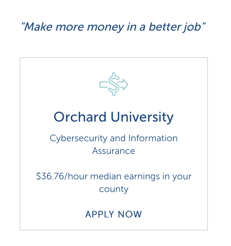
5. Advertise career outcomes, such as potential job titles and salaries
Prospective students show increased interest in program marketing which emphasizes returns-on-investment, such as jobs available to program graduates or pass rates for a related professional exam. Including this information on your program landing pages will help prospective students find the program that best matches their personal interests and career goals. Programs can turn passive interest into program enrollments by strategically marketing career outcomes on the program landing page.
Do: Engage Active and Inactive prospects with outcomes data
- Uses local demand data
- Attracts attention of prospects not actively searching for program

Don’t: Prospects filter out transaction ads
- Fails to communicate compelling value proposition
- Only appeals to prospects actively evaluating programs

6. Highlight key program differentiators prominently on the program landing page
In today’s crowded graduate, online, and adult learner markets, it’s critical program leaders identify and market their program’s strengths to stand out. Key differentiators could include faculty accolades or expertise, which help to communicate a program’s academic rigor. If applicable, highlight partnerships with employers to demonstrate your program’s professional value.
Although updating your website can be time-intensive and limited by tech infrastructure or internal expertise, these six updates can make a big impact in how adult learners learn about and engage with your programs.

More Blogs

Marketing teams are stretched thin. Here’s what the data says to do next.

The big bets that actually drive online enrollment growth
